
Wireframing Basics: Why Every Great Website Starts with a Sketch
Before a single pixel gets pushed in Figma or a line of code is written, successful web projects start somewhere much simpler: a wireframe. If you’ve ever wondered why agencies (including us at Dric.be) spend so much time on rough boxes and grey rectangles before showing pretty mockups, this guide is for you.
In this beginner-friendly walkthrough, you’ll learn the wireframing basics, see real examples of good vs bad wireframes, and discover how this simple step can dramatically reduce client revisions later in the process.

What Is a Wireframe?
A wireframe is the skeleton of your website. It’s a low-fidelity, black-and-white (or greyscale) visual blueprint that shows where each element will be placed on a page, without worrying about colors, typography, or images.
Think of it like an architect’s blueprint. Before building a house, you don’t pick paint colors. You first decide where the walls, doors, and windows go. Wireframes do exactly that for websites.
What a Wireframe Is NOT
- It’s not a final design
- It’s not a prototype with animations
- It’s not the place to choose fonts or brand colors
- It’s not meant to look polished
Why Wireframing Matters in the Web Design Process
Skipping the wireframe stage is one of the most expensive mistakes in web design. Here’s why this step is non-negotiable:
- It saves revision rounds. Clients debate layout structure on a sketch in 10 minutes instead of debating it on a polished mockup for 3 weeks.
- It aligns stakeholders early. Developers, designers, copywriters, and marketers all see the same plan before work starts.
- It forces content priorities. You can’t avoid the question: “What’s actually the most important thing on this page?”
- It exposes UX problems. Confusing navigation or missing CTAs become obvious before they’re expensive to fix.
- It speeds up the design phase. Once layout is approved, designers can focus on aesthetics, not structure.
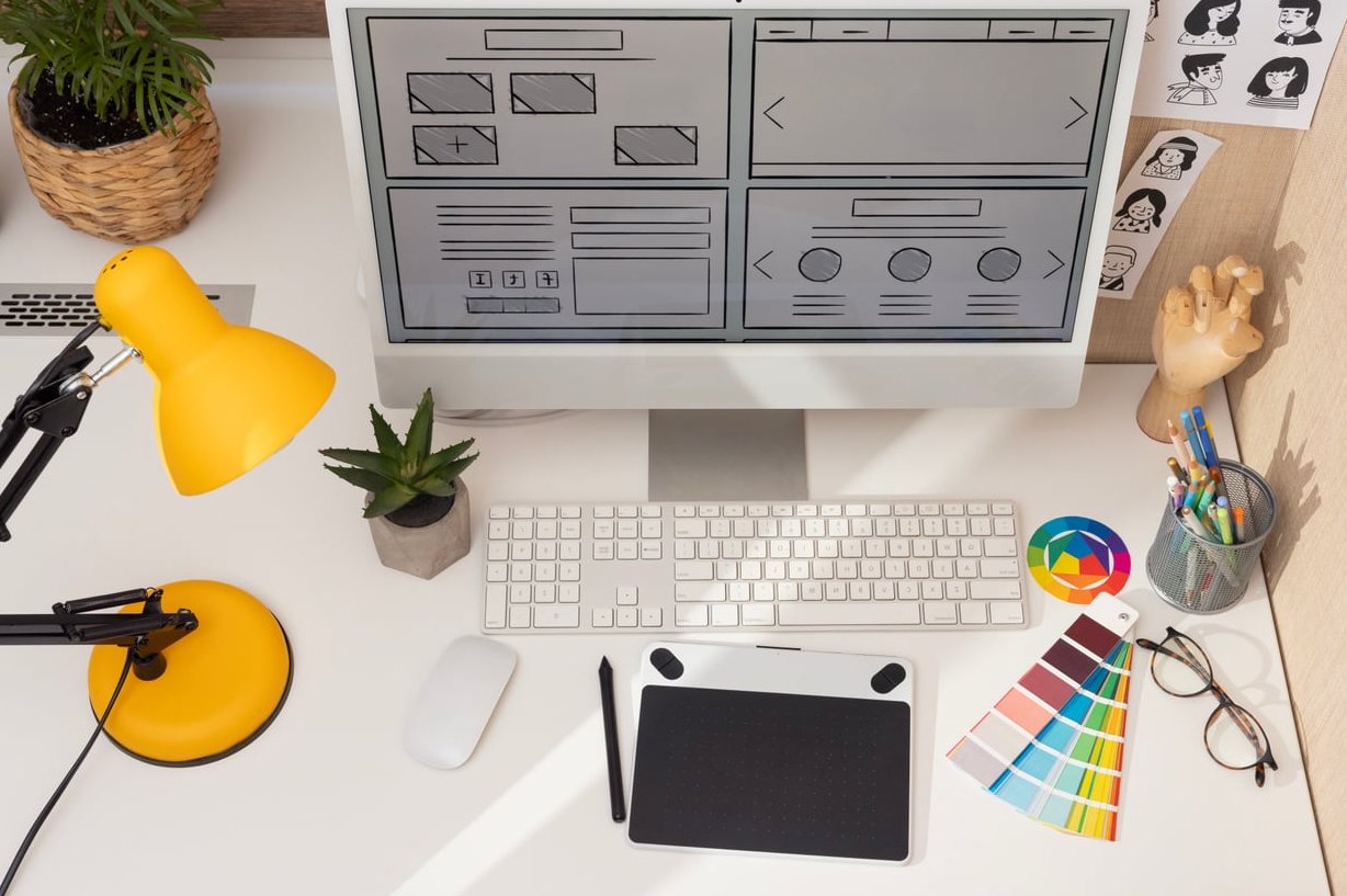
The 3 Levels of Wireframe Fidelity
| Type | What It Looks Like | When to Use It |
|---|---|---|
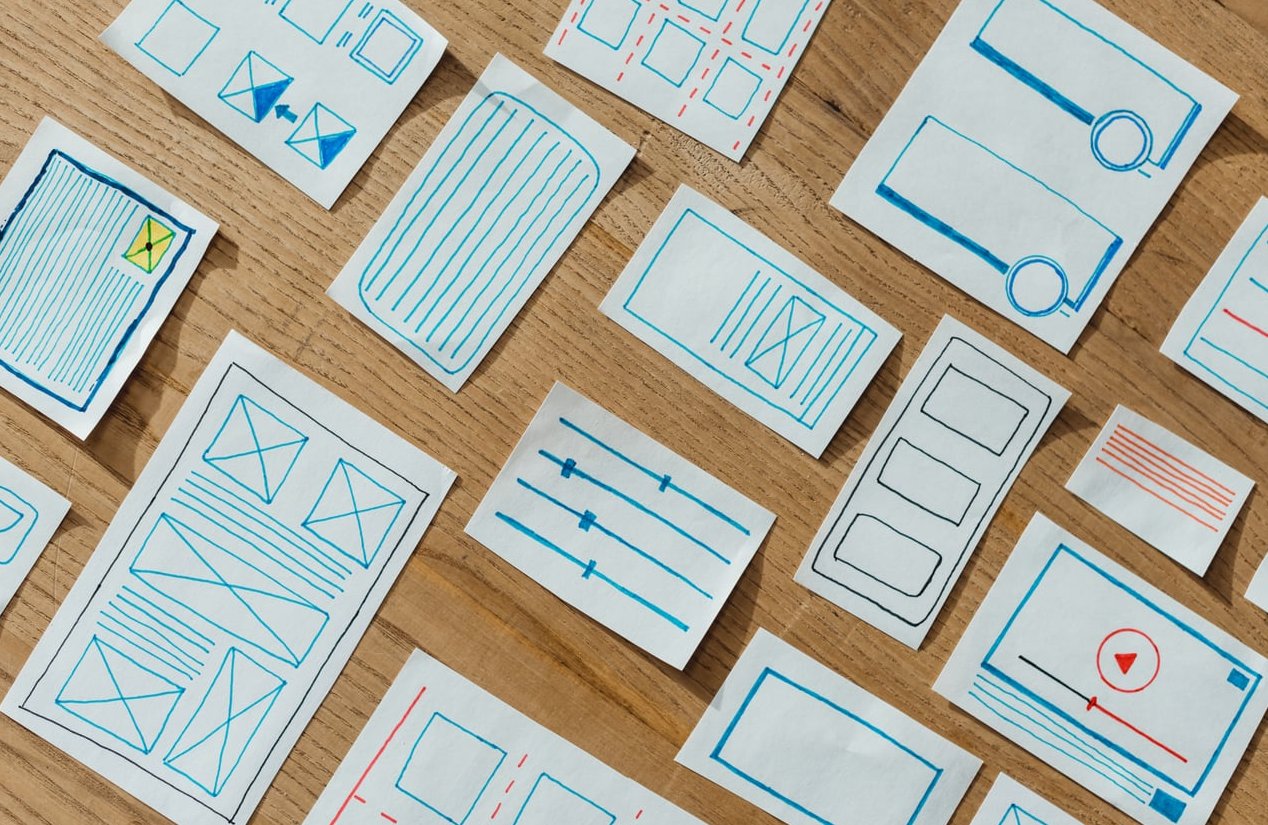
| Low-fidelity | Paper sketches, basic boxes, placeholder text | Early brainstorming, internal discussion |
| Mid-fidelity | Digital greyscale layouts with real spacing | Client validation, developer handoff prep |
| High-fidelity | Almost a real design, often clickable | User testing, final approval before design |
For beginners, we strongly recommend starting with low-fidelity wireframes. They’re fast, cheap, and impossible to over-polish.
Common Wireframing Conventions You Should Know
Wireframes use a visual shorthand. Learning these conventions makes your sketches readable by anyone on the team:
- Headers are drawn with thick horizontal lines
- Body text is shown with thinner stacked lines
- Images are represented by a box with an “X” through it
- Buttons are rectangles with a clear label like “CTA” or “Buy now”
- Navigation is a thin horizontal strip at the top with placeholder menu items
- Videos use a box with a triangle (play icon) inside

How to Create Your First Low-Fidelity Wireframe: Step by Step
Step 1: Define the Goal of the Page
Before drawing anything, answer this: What is the one thing the user must do on this page? Buy a product? Book a call? Read an article? Every element in your wireframe will support that goal.
Step 2: Create a Sitemap
Map out all the pages of your website and how they connect. This gives you context: a homepage wireframe is very different from a checkout wireframe.
Step 3: Start with Paper Sketches
Yes, real paper. Grab a pencil and sketch 3 to 5 quick variations of the layout in under 10 minutes each. The goal is volume, not beauty. This forces creative exploration.
Step 4: Move to a Digital Wireframe Tool
Once you’ve picked your favorite sketch, recreate it digitally. Popular tools for beginners include:
- Figma (free, browser-based, industry standard)
- Balsamiq (specifically built for fast low-fi wireframes)
- Whimsical (great for both sitemaps and wireframes)
- Excalidraw (free, hand-drawn aesthetic)
Step 5: Get Feedback and Iterate
Share the wireframe with your team or client. Ask specifically about structure, hierarchy, and clarity. Do not ask about colors or fonts at this stage. If someone comments on them, gently redirect the conversation.
Good vs Bad Wireframes: Concrete Examples
Example 1: Homepage Hero Section
| Bad Wireframe | Good Wireframe |
|---|---|
| Generic “Lorem ipsum” headline with no clear CTA | Realistic placeholder headline (“We build websites that convert”) plus a labeled CTA button |
| No clear visual hierarchy, all boxes the same size | Headline is largest, subheadline smaller, CTA visually prominent |
| Uses colors and fonts already | Pure greyscale, focus on structure |
Example 2: Product Page
- Bad: Image, title, and “Add to cart” button scattered without grouping
- Good: Image on the left, title + price + button stacked clearly on the right, reviews below the fold
Common Wireframing Mistakes to Avoid
- Adding colors too early kills the focus on structure
- Using “Lorem ipsum” everywhere hides content problems
- Skipping mobile wireframes in a mobile-first world is risky
- Making it too detailed defeats the speed advantage
- Not validating with stakeholders means surprises later
From Wireframe to Final Design: What Comes Next
Once your wireframe is approved, the typical flow continues with:
- Mid or high-fidelity mockups (adding brand colors, typography, imagery)
- Interactive prototypes for user testing
- Developer handoff with specs and components
- Front-end development and CMS integration
Each stage is faster and smoother because the structural decisions were already validated during wireframing.
Frequently Asked Questions
Do I need to know how to draw to create wireframes?
Not at all. Wireframes are made of basic shapes: rectangles, lines, and simple icons. If you can draw a box, you can wireframe.
How long should a wireframe take?
A low-fidelity wireframe for a single page should take 15 to 60 minutes. If you’re spending hours on one screen, you’re probably adding too much detail.
What’s the difference between a wireframe and a mockup?
A wireframe focuses on structure and layout with no styling. A mockup is a static visual design with colors, fonts, and images. A prototype goes one step further and adds interactivity.
Should I wireframe for mobile or desktop first?
In 2026, a mobile-first approach is still the standard. Start with the smallest screen, where space constraints force you to prioritize ruthlessly, then expand to tablet and desktop.
Are paper wireframes still relevant?
Absolutely. Paper is the fastest, cheapest, and most flexible wireframing tool. Many senior designers still start every project with a pencil and a notebook.
What’s the best free wireframing tool for beginners?
Figma is the most popular free option in 2026, with a huge community and free wireframe kits. Excalidraw is a great alternative if you prefer a hand-drawn feel.
Final Thoughts
Mastering the wireframing basics is one of the highest-leverage skills you can develop in web design. It saves time, reduces client friction, and produces better final products. Start simple, sketch often, and don’t aim for perfection at this stage. Perfection comes later, after the foundation is solid.
Need help planning your next website project? Our team at Dric.be guides clients through every step, from wireframes to launch. Get in touch to discuss your project.