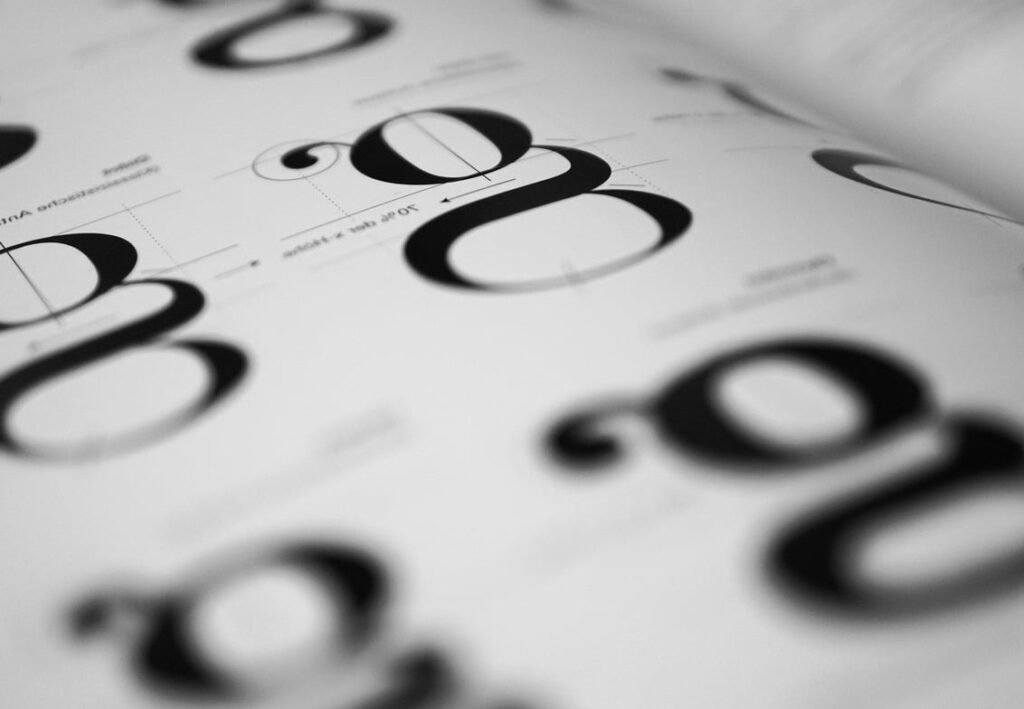
Choosing the right typography can make or break a website. The wrong font combination feels amateur, while the right pairing builds trust, guides the eye, and reinforces your brand personality. In this guide, we share the best Google Fonts pairings for 2026, organized by industry, with clear explanations of why each combination works.
Unlike generic lists, this curation focuses on contrast, readability, and brand fit so you can pick a pairing that genuinely matches your project, not just one that looks pretty in isolation.
What Makes a Great Google Fonts Pairing?
Before diving into the pairings, here are the three principles we use at DRIC to evaluate every combination:
- Contrast: A serif paired with a sans serif, or a heavy display font with a light body font, creates visual hierarchy.
- Readability: Body text must remain comfortable to read at 16 to 18 pixels, even on mobile devices.
- Brand personality: Geometric fonts feel modern and tech focused, while serifs feel editorial, trustworthy, or luxurious.
A successful pairing usually combines one expressive typeface for headlines with one neutral, highly legible typeface for body copy.
The 10 Best Google Fonts Pairings for 2026
1. Inter + Lora — For SaaS and Tech Startups
Build software that scales
Inter brings a clean, neutral interface feel while Lora adds editorial warmth to long form content. The contrast between geometric sans and humanist serif feels professional yet approachable.
Why it works: High legibility for UI text, with a serif that softens technical content.
2. Playfair Display + Source Sans 3 — For Luxury and Editorial Brands
Timeless elegance, redefined
Playfair Display delivers high contrast strokes and a couture feel, balanced by the quiet, modern Source Sans 3 for body copy.
Why it works: The dramatic serif establishes prestige, while the clean sans serif keeps reading effortless.
3. Space Grotesk + IBM Plex Sans — For Modern Agencies and Creative Studios
Design without compromise
Space Grotesk has personality with its slightly quirky terminals, while IBM Plex Sans grounds the design with engineering precision.
Why it works: Two sans serifs with distinct personalities create rhythm without clashing.
4. DM Serif Display + DM Sans — For E-commerce and Lifestyle
Discover what you love
Designed as a system, DM Serif Display and DM Sans share proportions that make them feel like a perfect family.
Why it works: Built-in harmony and strong contrast in weight.
5. Bricolage Grotesque + Manrope — For Innovative Tech and AI Products
The future, simplified
Bricolage Grotesque is one of the freshest releases on Google Fonts, with optical sizes that adapt beautifully. Manrope adds a friendly, rounded body voice.
Why it works: Modern, distinctive headlines paired with smooth, readable copy.
6. Fraunces + Inter — For Editorial Blogs and Personal Brands
Stories worth telling
Fraunces is a flexible variable serif with character, while Inter remains the gold standard for body legibility.
Why it works: Expressive headlines with predictable, comfortable body text.
7. Archivo Black + Archivo — For Bold Marketing Sites
Get noticed instantly
A super family pairing where Archivo Black brings impact and Archivo handles the supporting copy with neutrality.
Why it works: Maximum visual impact with built-in consistency.
8. Cormorant Garamond + Montserrat — For Wedding, Beauty, and Wellness
Beauty in every detail
Cormorant Garamond brings refined classical proportions, while Montserrat keeps things contemporary and clean.
Why it works: Romantic, elegant, but never dated.
9. Outfit + Plus Jakarta Sans — For Fintech and Modern B2B
Smarter financial decisions
Outfit offers geometric confidence, Plus Jakarta Sans brings warmth and excellent legibility at small sizes.
Why it works: Trustworthy, modern, and screen optimized.
10. Syne + Inter — For Portfolios and Creative Founders
Creative work, on display
Syne has bold geometric quirks that grab attention, while Inter keeps the body neutral and clean.
Why it works: Memorable headlines that show personality without sacrificing readability.

Quick Reference Table by Industry
| Industry | Headline Font | Body Font | Personality |
|---|---|---|---|
| SaaS / Tech | Inter | Lora | Professional, approachable |
| Luxury | Playfair Display | Source Sans 3 | Elegant, premium |
| Creative Agency | Space Grotesk | IBM Plex Sans | Modern, technical |
| E-commerce | DM Serif Display | DM Sans | Friendly, polished |
| AI / Innovation | Bricolage Grotesque | Manrope | Fresh, forward thinking |
| Editorial / Blog | Fraunces | Inter | Expressive, readable |
| Marketing | Archivo Black | Archivo | Bold, confident |
| Wellness / Beauty | Cormorant Garamond | Montserrat | Refined, calm |
| Fintech / B2B | Outfit | Plus Jakarta Sans | Trustworthy, modern |
| Portfolio | Syne | Inter | Creative, distinctive |

How to Implement Google Fonts on Your Website
- Visit fonts.google.com and select your two chosen typefaces.
- Pick only the weights you actually need (typically 400 and 700) to keep your site fast.
- Use the self-hosted method or the embed link with
display=swapfor better Core Web Vitals. - Define a clear typographic scale in your CSS (for example 16, 20, 24, 32, 48 pixels).
- Test on mobile, tablet, and desktop to confirm hierarchy and legibility.

Common Mistakes to Avoid
- Pairing two fonts that are too similar: Two geometric sans serifs with no contrast feel muddy.
- Loading too many weights: This kills performance with little visual benefit.
- Using display fonts for body copy: Decorative typefaces fatigue readers quickly.
- Ignoring multilingual support: If your audience is international, check that the font supports the required character sets.
FAQ: Best Google Fonts Pairings
How many fonts should I use on a website?
Two is ideal. One for headlines, one for body. A third can be added for accents like quotes or buttons, but only if it serves a clear purpose.
Are Google Fonts free for commercial use?
Yes. All fonts on Google Fonts are open source and free to use commercially, including for client projects.
Do Google Fonts slow down my website?
Only if used carelessly. Limit weights, use font-display: swap, and consider self-hosting to keep performance optimal.
What is the most readable Google Font for body text?
Inter, Source Sans 3, and Plus Jakarta Sans are among the most readable choices for screen body text in 2026.
Should I pair a serif with a sans serif?
It is the safest formula because the contrast is automatic. However, two sans serifs with different personalities (like Space Grotesk and IBM Plex Sans) can also work beautifully.
Final Thoughts
The best Google Fonts pairings are not the trendiest ones, they are the ones that match your brand voice and serve your readers. Start with a clear personality, prioritize readability, and always test in context. The combinations above are a strong starting point for any modern website project in 2026.
Need help choosing typography for your next website or rebrand? The DRIC team can help you craft a typographic system that fits your audience and converts. Get in touch with us through dric.be.