Why Every Web Design Project Needs a Mood Board
Starting a web design project without a mood board is like building a house without a blueprint. You might have a general idea of what you want, but without a visual reference point, miscommunication and costly revisions are almost guaranteed.
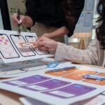
A mood board for web design is a curated collection of images, colors, typography samples, textures, and other visual elements that define the look and feel of a website before a single pixel is designed. It captures the emotions, values, and aesthetic direction of the project in a format that everyone, from designers to clients to stakeholders, can understand at a glance.
Whether you are a freelance designer looking to streamline client communication or a small business owner preparing to work with a design team, this guide will walk you through every step of creating an effective mood board that saves time, reduces guesswork, and aligns creative vision from day one.
What Exactly Is a Web Design Mood Board?
A mood board is essentially a visual collage. In the context of web design, it goes beyond random inspiration. It is a deliberate arrangement of visual elements that communicate the intended direction for a website’s design.
A well-built mood board typically includes:
- Color palettes that reflect the brand personality
- Typography samples showing heading and body font pairings
- Photography and imagery that set the emotional tone
- Texture and pattern references
- UI element inspiration such as buttons, cards, or navigation styles
- Keywords or short phrases that describe the desired feeling
Unlike a wireframe or a full mockup, a mood board is not about layout or structure. It is about feeling and direction. As the UX research community at NN/g puts it, mood boards are used to visually show the feelings or values that a digital product should create.
Mood Board vs. Style Tile vs. Wireframe: What Is the Difference?
Before diving into the process, it helps to understand where a mood board fits in the design workflow compared to other common deliverables.
| Deliverable | Purpose | Level of Detail | When It Is Used |
|---|---|---|---|
| Mood Board | Define the visual tone and emotional direction | Low (abstract, conceptual) | Very beginning of a project |
| Style Tile | Show specific design choices (fonts, colors, UI patterns) | Medium | After mood board approval |
| Wireframe | Map out page layout and content hierarchy | Medium to High | After direction is confirmed |
| Mockup | Present a near-final visual representation | High | Before development begins |
The mood board comes first. It is the foundation on which every other design decision is built.
Step-by-Step: How to Create a Mood Board for Web Design
Step 1: Define the Project Direction and Goals
Before you open any design tool, take the time to understand what the website needs to communicate. This is the most important step and the one most often skipped.
Ask these questions (to yourself or your client):
- Who is the target audience? (Age, profession, interests, expectations)
- What are 3 to 5 adjectives that describe the desired brand feeling? (e.g., bold, minimal, luxurious, playful, trustworthy)
- Are there any competitor websites the client admires or wants to differentiate from?
- What is the primary goal of the site? (Sell products, generate leads, inform, build community)
- Does existing brand material (logo, brand guidelines, previous marketing) exist?
Pro tip: Document these answers in a short creative brief. Even a half-page document will give you a solid starting point and something to refer back to when making mood board decisions.
Step 2: Collect Existing Brand Material
If you are working with an existing brand, gather everything you already have:
- Logo files and brand guidelines
- Current website screenshots
- Business cards, brochures, packaging
- Social media posts and ads
- Photography the brand already uses
This material helps you understand what is already established and what can (or should) evolve. Even if the client wants a complete refresh, knowing where they are coming from provides valuable context.
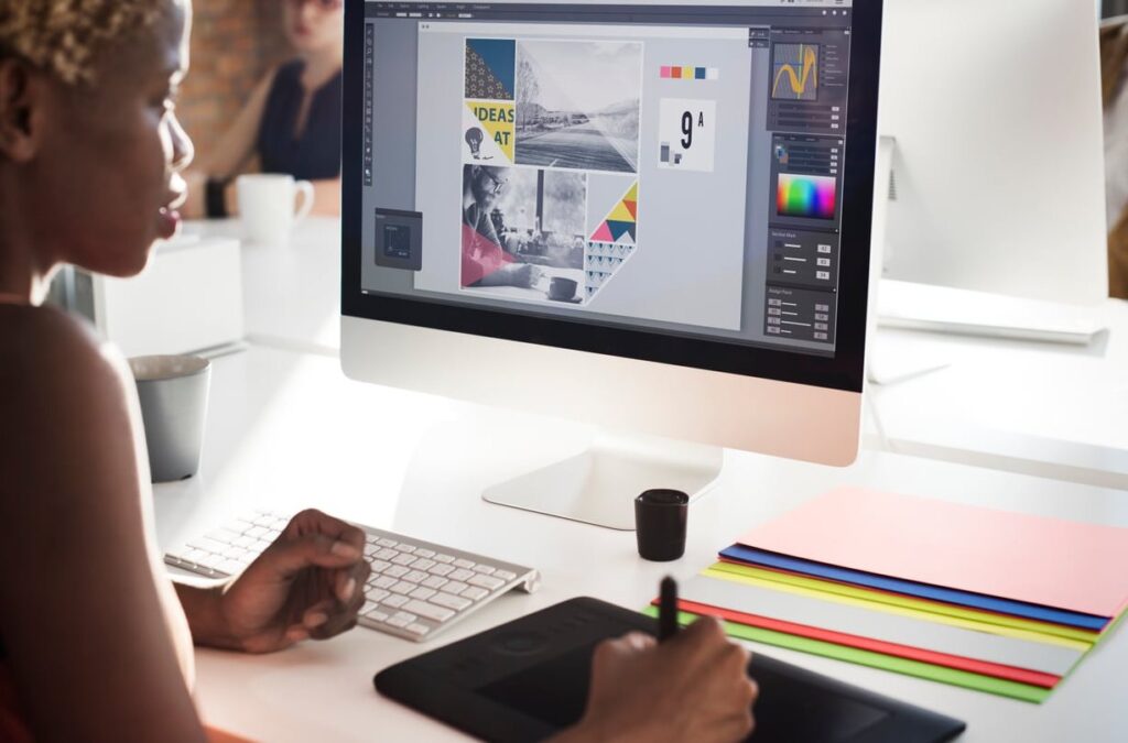
Step 3: Choose the Right Mood Board Tool
The tool you use matters less than how you use it, but picking the right one can speed up your workflow significantly. Here is a comparison of popular tools for creating a mood board for web design in 2026:
| Tool | Best For | Cost | Key Feature |
|---|---|---|---|
| Figma | Designers already in the Figma ecosystem | Free tier available | Mood board templates, real-time collaboration |
| Milanote | Visual thinkers, flexible layouts | Free tier available | Drag-and-drop board with web clipper |
| Canva | Non-designers and small business owners | Free tier available | Huge template library, very beginner-friendly |
| Quick inspiration gathering | Free | Endless visual inspiration, secret boards | |
| Adobe Express | Teams using Adobe Creative Cloud | Included with CC subscription | Tight integration with Photoshop and Illustrator |
Our recommendation: If you are a designer, use Figma or Milanote for maximum flexibility. If you are a business owner doing this yourself, Canva is the easiest place to start.
Step 4: Gather Inspiring Imagery
Now comes the fun part. Start collecting images that match the emotional direction you defined in Step 1. Cast a wide net first, then narrow down later.
Where to find inspiration:
- Dribbble and Behance for web design and UI inspiration
- Unsplash and Pexels for high-quality photography
- Pinterest for broad visual exploration
- Awwwards and SiteInspire for live website references
- Brand photography provided by the client
What types of images to include:
- Photos that evoke the right emotion (landscapes, lifestyle shots, product photography)
- Screenshots of websites or apps you admire
- Illustrations, icons, or graphic elements that fit the style
- Texture close-ups (wood, marble, fabric, paper) if relevant
Important rule: Aim for 15 to 25 images maximum. Too many items make the mood board confusing rather than clarifying. Every image should have a reason to be there.
Step 5: Extract and Define a Color Palette
Color is one of the most powerful elements on your mood board. It sets the emotional tone before anyone reads a single word.
Here is how to approach color extraction:
- Start with the brand colors if they already exist. These are non-negotiable anchors.
- Pull complementary colors from your collected images. Tools like Coolors, Adobe Color, or the eyedropper tool in Figma make this easy.
- Limit your palette to 5 to 7 colors: typically a primary color, a secondary color, one or two accent colors, and two to three neutrals (backgrounds, text).
- Test contrast. Make sure your palette works for accessibility. Use a contrast checker to verify that text colors are readable against backgrounds.
Display your color palette as a row of swatches on the mood board, ideally with hex codes noted underneath for easy reference later.
Step 6: Select Typography Samples
Typography carries a huge amount of visual weight. The fonts you choose communicate personality just as much as color and imagery do.
Include on your mood board:
- A heading font (or two options for comparison)
- A body text font
- A sample pairing showing how they work together
Use Google Fonts or Typewolf to explore pairings. Show actual words on the mood board, not just the font name. For example, type out the company name or a short tagline in the chosen fonts so the client can see how it feels.
Step 7: Add Keywords and Descriptive Notes
Sprinkle a few keywords or short phrases across your mood board. These act as anchors that reinforce the intended direction. They are especially helpful when presenting to clients who might interpret images differently than you intended.
Examples:
- “Clean and confident”
- “Warm but professional”
- “Bold, modern, high energy”
- “Approachable luxury”
Keep these short. Three to five descriptors are enough.
Step 8: Arrange Everything Thoughtfully
The layout of your mood board matters. It should feel cohesive, not chaotic.
Layout tips:
- Place the most representative image large and center (or top-left) to set the dominant tone
- Group related items together (e.g., color swatches near each other, typography samples side by side)
- Leave some white space so items can breathe
- Use a consistent border or spacing between elements
- Consider a grid layout for a clean look, or an overlapping collage for a more creative feel
The style of the mood board itself should hint at the design direction. A mood board for a minimalist architecture firm should look different from one for a children’s toy brand.
Step 9: Review and Refine Before Presenting
Before showing the mood board to anyone, step back and do a final review:
- Does every element support the direction defined in Step 1?
- Is there anything that feels out of place or contradictory?
- Could someone who has never heard the brief look at this mood board and describe the intended feeling accurately?
- Is it too busy? Remove anything that does not earn its spot.
If possible, show it to a colleague or fellow designer for a quick gut-check before the client presentation.
How to Present a Mood Board to Clients
This is where many designers stumble. A mood board is only useful if the client understands it and can give actionable feedback. Here is how to set up a successful presentation:
Set the Context First
Before showing anything, remind the client of the project goals and the creative brief. Say something like: “Based on our conversations about your audience and brand values, here is the visual direction we are proposing.”
Explain What They Are Looking At
Many clients have never seen a mood board before. Make it clear that this is not the final design. It is a directional tool. Explain that you are looking for feedback on the overall feeling, not specific layout or content decisions.
Ask the Right Questions
Instead of asking “Do you like it?” (which invites subjective, unhelpful answers), try:
- “Does this feel aligned with your brand’s personality?”
- “Is this the kind of emotion you want visitors to experience on your site?”
- “Are there any elements that feel off or that you would like to push further?”
- “On a scale of 1 to 10, how close is this to what you envisioned?”
Offer Two Directions When Appropriate
If the brief left room for interpretation, consider presenting two mood boards that explore different directions. Label them clearly (e.g., “Direction A: Bold and Energetic” vs. “Direction B: Refined and Minimal”). This gives clients a concrete choice rather than an open-ended opinion.
Document the Feedback
After the meeting, summarize what was agreed upon. Which elements were approved? What needs to change? This documentation becomes a reference point for the rest of the project and protects both parties from scope creep.
Mood Board Examples for Web Design: What Good Looks Like
To give you a clearer picture, here are three common web design mood board styles and when to use them:
1. The Grid Board
A clean, structured grid with evenly spaced images, a color palette row, and typography samples in a sidebar. Best for corporate, professional, or minimalist projects.
2. The Collage Board
Overlapping images, hand-drawn elements, and textures layered together. Best for creative agencies, lifestyle brands, or projects with a strong artistic identity.
3. The Annotated Board
Similar to a grid board but with notes and labels next to each element explaining why it was chosen. Best for client-facing presentations where extra context helps.
Common Mistakes to Avoid
Even experienced designers make these mistakes when building mood boards for web design:
- Including too many items. A cluttered mood board defeats its purpose. Be selective.
- Mixing conflicting styles. If half your images are dark and moody while the other half are bright and playful, the board sends mixed signals.
- Skipping the brief. Jumping straight to image gathering without defining direction leads to unfocused boards.
- Using only website screenshots. A mood board should evoke a feeling, not just show existing websites. Mix photography, textures, and abstract visuals.
- Not involving the client early enough. The mood board exists to align vision. If you wait until the mockup stage to get alignment, you are too late.
- Forgetting about accessibility. Beautiful color palettes that fail contrast standards will cause problems down the line.
Free Mood Board Templates to Get You Started
If you want to skip the blank canvas and start with a template, here are some solid options:
- Figma Community: Search for “mood board template” in Figma’s community section. There are dozens of free, well-designed templates you can duplicate and customize.
- Canva: Canva offers an extensive library of mood board templates that are drag-and-drop simple. Great for non-designers.
- Milanote: Milanote provides a dedicated web design mood board template with pre-labeled sections for colors, typography, imagery, and notes.
How a Mood Board Fits Into Our Design Process at dric.be
At dric.be, we consider the mood board phase essential for every web design project we take on. It is always part of our discovery and strategy phase, before any design work begins.
Here is why we believe in it so strongly:
- It reduces revision cycles by catching misalignment early
- It gives clients a voice in the creative process without overwhelming them with technical decisions
- It provides a shared reference point that the entire team (designers, developers, copywriters) can refer back to throughout the project
If you are planning a website project and want to see how a professional mood board process works in practice, get in touch with our team. We would be happy to walk you through it.
Frequently Asked Questions
What is a mood board for web design?
A mood board for web design is a visual collage of images, colors, typography, textures, and other design elements that communicate the intended look, feel, and emotional direction of a website before actual design begins. It is a tool for aligning creative vision between designers and stakeholders.
How many images should a web design mood board include?
Aim for 15 to 25 visual elements in total. This includes photographs, screenshots, color swatches, typography samples, and any textures or patterns. Fewer items with clear intention are always better than a crowded board that lacks focus.
What is the best free tool to create a mood board?
For designers, Figma offers excellent free mood board templates with real-time collaboration. For non-designers or small business owners, Canva is the most beginner-friendly option with a large library of customizable templates.
What is the difference between a mood board and a style guide?
A mood board is created at the start of a project to explore and communicate the desired visual direction. A style guide (or brand guidelines document) is a more detailed and finalized document that codifies specific design rules like exact color values, font sizes, spacing rules, and logo usage. The mood board often informs what eventually becomes the style guide.
Should I present one mood board or multiple options to a client?
If the creative brief is very specific, one well-crafted mood board is usually sufficient. If there is room for interpretation or the client is still exploring their preferences, presenting two distinct directions gives them a meaningful choice and often leads to faster, more confident decisions.
Can I create a mood board if I am not a designer?
Absolutely. Tools like Canva and Milanote are specifically designed to be accessible to non-designers. Start with a template, gather images that resonate with the feeling you want your website to convey, add your brand colors, and you will have a useful visual reference to share with your design team.